


Flat design trend - a more versatile and sophisticated design with a minimalist effect.
The latest trend in web designing is a flat design. It has become very apparent how Windows 8, iOS and Android devices are embracing a flat design for their user interface design lately. A flat ui design grows its popularity among these platforms because it presents a more versatile and sophisticated design with a minimalist effect. No drop shadows, textures and gradients are used in a flat design, giving the web interface of the platforms a more straightforward, simple yet elegant look and feel. Flat web designs usually highlight solid colors and prominent typography signs or figures as its elements.
The advantages of using flat web designs
There are varied reasons why Windows, iOS, and Android prefer using a flat web design for their UI. The main objective in web designing is basically to provide website viewers a smooth and convenient navigation experience through the user interface on each platform and one of the best means by which clarity and crispness of website viewing is achieved is to eliminate the three dimensional effects from the UI on each platform. A flat web design accomplishes this objective and it also delivers the simplicity effect that allows for quicker navigational function and faster performance of a website.
Microsoft flat design principles
Microsoft embraces a more minimalist design in its Windows 8 user interface with the objective of delivering a better typography, color and high quality pixel experience to the consumers. The company welcomes the new design principle that do away too complicated drop down menus, icon studded toolbars and artificial animated reflection. Even the traditional start button icon displayed on its interface was removed. Instead the web designing principles on Windows 8 is not to exhibit adornment from its users but rather to give them a slicker and more intuitive visual experience that comes from a flat design.
Windows 8 is considered to have by far the simplest yet more intuitive user interface that embraces a flat ui design principle in achieving a minimalist look and feel. Its interface provides the user a more immersive full screen experience in the absence of toolbars or framed windows, giving a more minimal interface. Clean typography and flat design icons are only seen from the Windows 8 UI while it also present intermittent animations to display real time updates whenever one receives a new email or a calendar reminder. It uses mainly live tiles with grids that allow for horizontal scrolling using a landscape display layout.
Apple UI Enhancements embracing the flat web design
Apple iOS 7 is marked with a more minimalist design that embraces an apparent flat web design principle. It has been noted that the traditional glossy icons and the use of drop shadows are no longer used by Apple in its new user interface. They are now replaced by the more subtle gradients, bright colors and lighter soft shadows in their iOS designs. The objective of a flat web design is to introduce a bolder typography effects with less graphics on the user interface. Adding more elements to the user interface can cause a significant distraction on the UI and Apple aims to re-design its iOS to attain a better UI experience to its users by delivering more improvements on its content while eliminating the distracting effects on its elements by toning down its UI patterns, gradients, shadow and texture.
The iOS 7 also introduces a modern looking yet thinner typeface using Helvetica Neue Light in order to provide a lighter and more breathable user interface and cleaner layout. Among the subtle changes made by Apple is adding a parallax effect that add more depth on its launch screen. iOS 7 users will now experience a more intuitive UI with a modern-looking typeface that do away heavy textures and gradients as it delivers a more breathable layout interface.
Google’s approach in flat design for Android
Google embraced the flat design principles when it launched its Ice Cream Sandwich 4.0 which sets the new standards in the UI of Android devices. The new distinct design of Google for Android consists of a minimalist card-type design interface which is more notably emphasized in the Google Now. The new google flat design in Android use more white spaces to deliver cleaner and flatter look and feel on the Android user interface. It also uses the Roboto typeface consisting of simplistic font looks with open curves in order to produce a cleaner overall layout and easy to digest font displays.
Android devices show more subtle gradients and textures as well as lighter shadow elements to highlight its stacked card effect. Notable is the organization of the font size and colors used by Google to promote better looking textual presentation. The title headers are bigger, bolder and dark while the descriptive titles are sometimes italicized and in gray. The vector illustrations used by Google in its Android devices deliver a more flat toned icons and illustrations that promote a modern looking, cleaner and simplistic effect and UI design feel.
The promising trend of flat web design
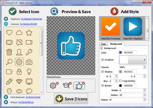
The three giant platforms Google, Apple and Windows recognize the valuable role of flat web design principles in delivering better quality UI viewing experience in their products. These flat design examples allow the viewers to enjoy a cleaner, smoother and minimalist viewing experience that promotes better interaction and engagement on the user interface. Web designer are using the flat web design approach by using flat icons on their web designs too. Using Iconion as a popular application that allows the user to create beautiful flat icons, it is possible to deliver a more impressive look on your icon designs with a minimalist effect. The Iconion likewise embraces the flat design principle that produces a cleaner interface in an icon design thereby giving more substance to its graphic presentation while doing away from using distracting elements of gradients and shadows. Using Iconion it is convenient to use flat icons in your web design projects and to produce the same minimalist effects that Apple, Google and Windows sought to achieve in their products.
Related
Get Iconion
Free download for Windows and Mac!