Bootstrap Tables Design
Intro
Tables are present in the majority of the apps (web, desktop or mobile app) and they are a key element in providing information to the end user. The HTML tables are actually used to present data in framework way such as columns and rows . With working with Bootstrap 4 framework you are able to easily enhance the look of the table.
In the present day, with the importance that the user interface has, understanding precisely how to improve the appearance of a Bootstrap Tables Sortable comes to be as relevant as it is. In this case, one of the systems that have come to be reference is Bootstrap. This front-end framework, among plenty of other features , gives a number of components for designing and improving the display of various components, such as tables.
Standard table in Bootstrap
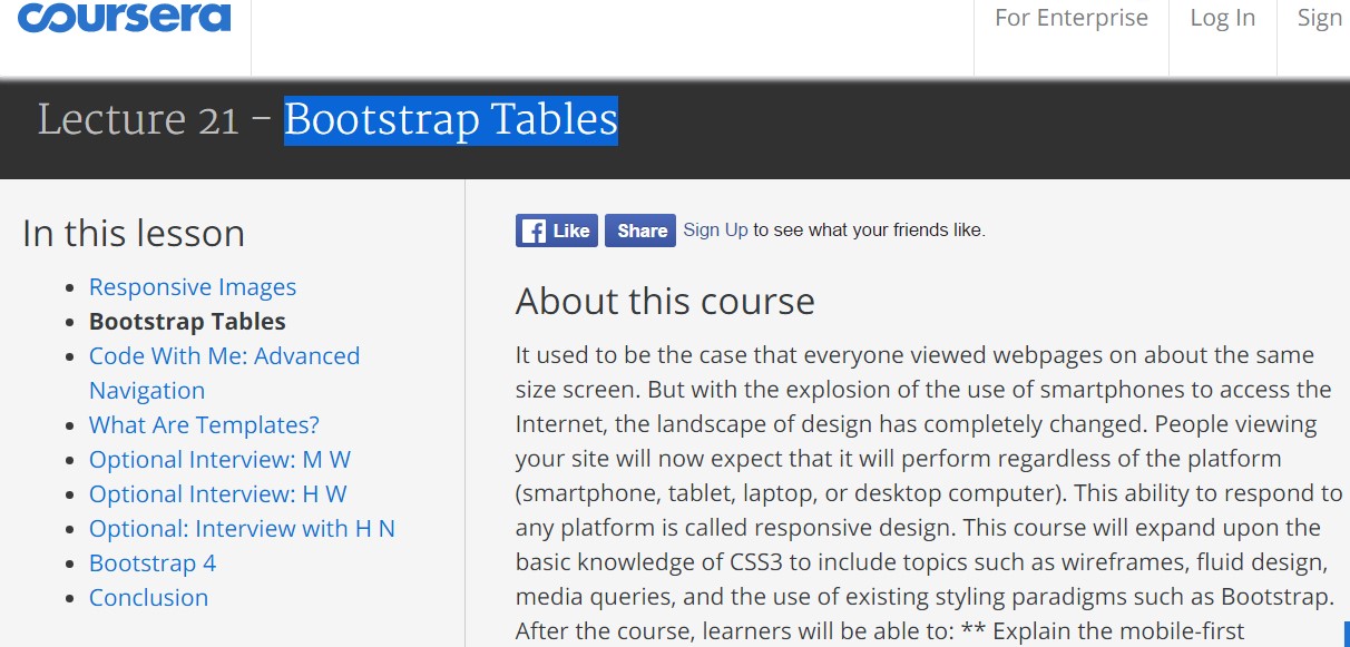
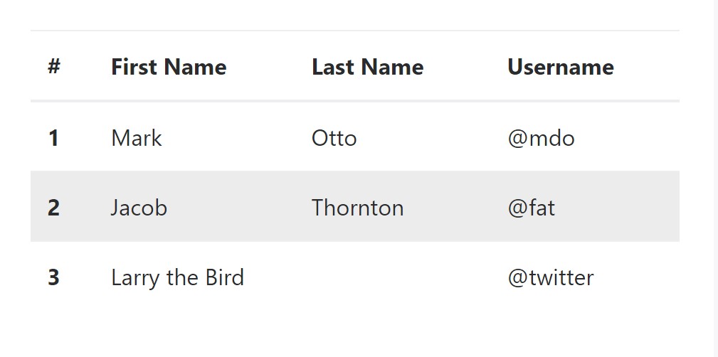
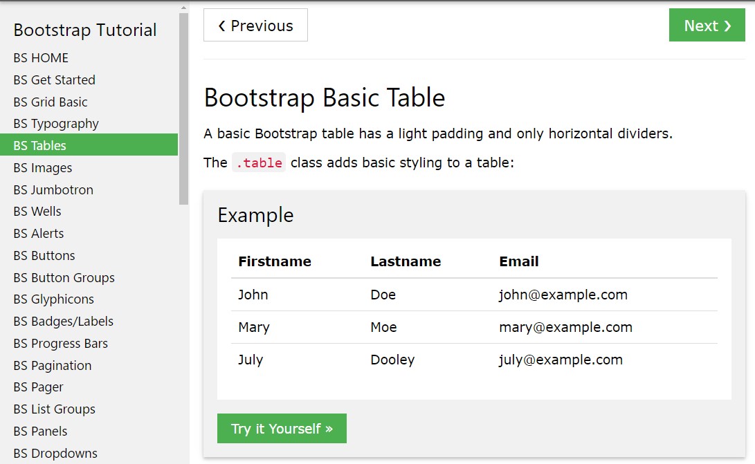
To form a table with Bootstrap, just include the table class to the <table> tag, and some visible format will currently be applied , as displayed on the screenshot .
<table class="table">
<thead>
<tr>
<th>#</th>
<th>First Name</th>
<th>Last Name</th>
<th>Username</th>
</tr>
</thead>
<tbody>
<tr>
<th scope="row">1</th>
<td>Mark</td>
<td>Otto</td>
<td>@mdo</td>
</tr>
<tr>
<th scope="row">2</th>
<td>Jacob</td>
<td>Thornton</td>
<td>@fat</td>
</tr>
<tr>
<th scope="row">3</th>
<td>Larry</td>
<td>the Bird</td>
<td>@twitter</td>
</tr>
</tbody>
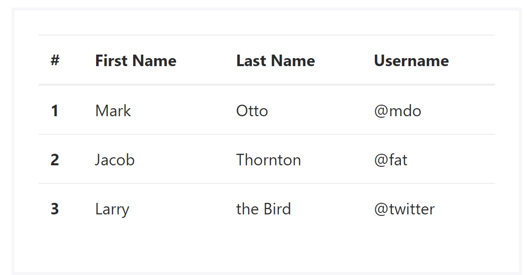
</table>Inverse tables.
One of the new tables in Bootsrap 4 is the inverse tables. Class .table-inverse is able to change the color selection of the table.
<table class="table table-inverse">
  <thead>
    <tr>
      <th>#</th>
      <th>First Name</th>
      <th>Last Name</th>
      <th>Username</th>
    </tr>
  </thead>
  <tbody>
    <tr>
      <th scope="row">1</th>
      <td>Mark</td>
      <td>Otto</td>
      <td>@mdo</td>
    </tr>
    <tr>
      <th scope="row">2</th>
      <td>Jacob</td>
      <td>Thornton</td>
      <td>@fat</td>
    </tr>
    <tr>
      <th scope="row">3</th>
      <td>Larry</td>
      <td>the Bird</td>
      <td>@twitter</td>
    </tr>
  </tbody>
</table>
Additional classes
For tables there are additionally some classes that make it possible for you to use several looks to a table, they are:
● table-striped Toggles the colour of table rows;
● table-bordered Adds border to table;
● table-hover Activates the highlight of a Bootstrap Tables Responsive line when we hover the mouse cursor over it;
● table-condensed Decreases the height of table rows, making it more compact.
To apply such designs, just simply add in the chosen classes to the: <table>: <table class="table table-striped table-bordered table-condensed table-hover">
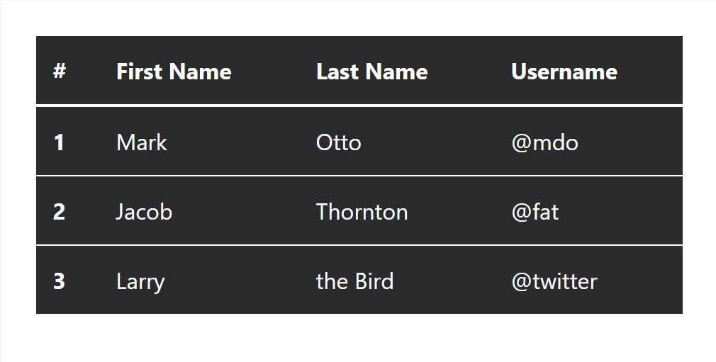
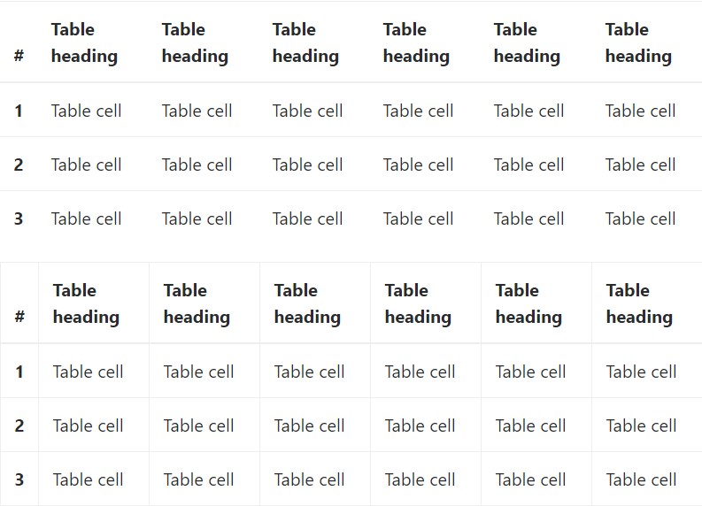
Table head options
The same as default and inverted tables, put into action one of two modifier classes to make <thead> appear dark or light gray.
img
<table class="table">
<thead class="thead-inverse">
<tr>
<th>#</th>
<th>First Name</th>
<th>Last Name</th>
<th>Username</th>
</tr>
</thead>
<tbody>
<tr>
<th scope="row">1</th>
<td>Mark</td>
<td>Otto</td>
<td>@mdo</td>
</tr>
<tr>
<th scope="row">2</th>
<td>Jacob</td>
<td>Thornton</td>
<td>@fat</td>
</tr>
<tr>
<th scope="row">3</th>
<td>Larry</td>
<td>the Bird</td>
<td>@twitter</td>
</tr>
</tbody>
</table>
<table class="table">
<thead class="thead-default">
<tr>
<th>#</th>
<th>First Name</th>
<th>Last Name</th>
<th>Username</th>
</tr>
</thead>
<tbody>
<tr>
<th scope="row">1</th>
<td>Mark</td>
<td>Otto</td>
<td>@mdo</td>
</tr>
<tr>
<th scope="row">2</th>
<td>Jacob</td>
<td>Thornton</td>
<td>@fat</td>
</tr>
<tr>
<th scope="row">3</th>
<td>Larry</td>
<td>the Bird</td>
<td>@twitter</td>
</tr>
</tbody>
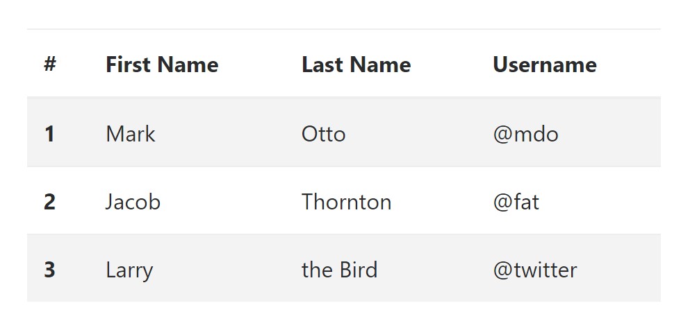
</table>Striped rows
Zebra-like stripes can be incorporated with the .table-striped class, an example
<table class="table table-striped">
  <thead>
    <tr>
      <th>#</th>
      <th>First Name</th>
      <th>Last Name</th>
      <th>Username</th>
    </tr>
  </thead>
  <tbody>
    <tr>
      <th scope="row">1</th>
      <td>Mark</td>
      <td>Otto</td>
      <td>@mdo</td>
    </tr>
    <tr>
      <th scope="row">2</th>
      <td>Jacob</td>
      <td>Thornton</td>
      <td>@fat</td>
    </tr>
    <tr>
      <th scope="row">3</th>
      <td>Larry</td>
      <td>the Bird</td>
      <td>@twitter</td>
    </tr>
  </tbody>
</table>
Hover Rows
To create a hover side effect in the rows of your table include the .table-hover class:
<table class="table table-hover">
  <thead>
    <tr>
      <th>#</th>
      <th>First Name</th>
      <th>Last Name</th>
      <th>Username</th>
    </tr>
  </thead>
  <tbody>
    <tr>
      <th scope="row">1</th>
      <td>Mark</td>
      <td>Otto</td>
      <td>@mdo</td>
    </tr>
    <tr>
      <th scope="row">2</th>
      <td>Jacob</td>
      <td>Thornton</td>
      <td>@fat</td>
    </tr>
    <tr>
      <th scope="row">3</th>
      <td colspan="2">Larry the Bird</td>
      <td>@twitter</td>
    </tr>
  </tbody>
</table>
Bordered Table
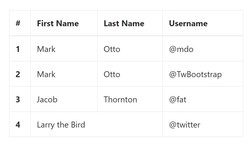
You are able to add in the borders on every single table slide and a cell with the .table-bordered class:
<table class="table table-bordered">
  <thead>
    <tr>
      <th>#</th>
      <th>First Name</th>
      <th>Last Name</th>
      <th>Username</th>
    </tr>
  </thead>
  <tbody>
    <tr>
      <th scope="row">1</th>
      <td>Mark</td>
      <td>Otto</td>
      <td>@mdo</td>
    </tr>
    <tr>
      <th scope="row">2</th>
      <td>Mark</td>
      <td>Otto</td>
      <td>@TwBootstrap</td>
    </tr>
    <tr>
      <th scope="row">3</th>
      <td>Jacob</td>
      <td>Thornton</td>
      <td>@fat</td>
    </tr>
    <tr>
      <th scope="row">4</th>
      <td colspan="2">Larry the Bird</td>
      <td>@twitter</td>
    </tr>
  </tbody>
</table>
Condensed Table
If you intend to make your table more compact - on that occasion you can certainly cut cell padding in half with this class: .table-condensed.
Bear in mind that, while Bootstrap 4 uses .table-sm to condense a table, Bootstrap 3 uses .table-condensed. Both cut cell padding in half.
<table class="table table-sm">
  <thead>
    <tr>
      <th>#</th>
      <th>First Name</th>
      <th>Last Name</th>
      <th>Username</th>
    </tr>
  </thead>
  <tbody>
    <tr>
      <th scope="row">1</th>
      <td>Mark</td>
      <td>Otto</td>
      <td>@mdo</td>
    </tr>
    <tr>
      <th scope="row">2</th>
      <td>Jacob</td>
      <td>Thornton</td>
      <td>@fat</td>
    </tr>
    <tr>
      <th scope="row">3</th>
      <td colspan="2">Larry the Bird</td>
      <td>@twitter</td>
    </tr>
  </tbody>
</table>
Contextual Classes of Bootstrap Tables Generator
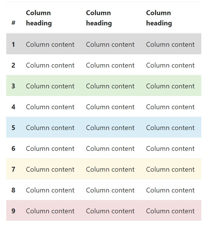
Use the contextual classes to color a table cells (<td>) and table rows (<tr>):
<!-- On rows -->
<tr class="table-active">...</tr>
<tr class="table-success">...</tr>
<tr class="table-warning">...</tr>
<tr class="table-danger">...</tr>
<tr class="table-info">...</tr>

<!-- On cells (`td` or `th`) -->
<tr>
  <td class="table-active">...</td>
  <td class="table-success">...</td>
  <td class="table-warning">...</td>
  <td class="table-danger">...</td>
  <td class="table-info">...</td>
</tr>
Changing the rows of a table Bootstrap 3 doesn't use the .table- prefix for its contextual classes. Bootstrap 3 uses .active whereas Bootstrap 4 uses .table-active.
● active: Puts on the focus color to the table row or table cell
● success: Indicates a positive or successful action
● info: Indicates a neutral information change or action
● warning: Indicates a caution that you might need attention
● danger: Indicates a potentially negative or dangerous action
Responsive Tables
To create a responsive table - use the .table-responsive class. Table rolls in the horizontal position on gadgets that under 768px. If the machine is larger than 768px wide, then you will see no difference :
Bootstrap 4 allows you to add the .table-responsive class to the actual <table> element. Bootstrap 3 tables required that you add that class to a parent <div> element.
Check out several video clip information relating to Bootstrap 4 tables
Related topics:
Bootstrap tables official records
W3schools:Bootstrap table tutorial
Bootstrap Tables Lecture