Bootstrap eCommerce Template Review
Whatever we happen to make a living of – whether it’s an actual product or a service we're providing at the end of the day it all narrows down to one – selling it to whomever might need it. It might be the neighbor next door, but now in the light of the world becoming smaller and smaller due to the Internet it might as well be someone who drinks the first coffee for the morning while we're having dinner after long day at work. Yep! The Internet makes it possible to sell our great stuff all over around.
However, just like in the old days when in order to sell something one was needing a stall on the marketplace for showcasing his / hers great product – now in the ages of the Net having an appealing (and of course mobile friendly) web page doing pretty much the same thing – telling the world what we're offering – is not a lox any more, but a necessity.
Good news are now with the Mobirise Mobile Web builder even if one doesn't have much knowledge in web design he or she could still create a great looking and fully functional mobile-friendly web page in an easy and even fun way – just by dragging and dropping the most appropriate blocks from the vast library of predefined appearances, easily shaping them in order to best relay the needed message. The app is pretty easy and intuitive to use but, especially in the last few month became so powerful that it's quite often used by professionals in their everyday workflow. Personally I'm using it every day and I love it since it saves me much time and efforts helping me focus on what's important – the content, not bothering for the trivial stuff and getting in touch with the code only when I need to make some very specific adjustments. Frankly – the blocks library is so rich I more and more rarely need to do it with each new theme and version.
Which turns us to the main reason of the conversation – if you need an impressive web store but happen to be picky on each and every detail of the presentation of your precious products, lack either time or money to hire a professional web designer or just are curious about how the magic takes place – with the Mobirise Builder and the StoreM4 Bootstrap eCommerce Template you can easily create an eCommerce website from scratch and you don't need to be a web expert at all. As a matter a fact – you don't even need to have any knowledge in HTML / CSS / JS code to – you can set up a great store without even taking a look at the code.
All you need is great products and a strong concept and vision – you'll get surprised how easy and fun the whole process is.
In this one we're about to take a detailed look over the StoreM4 Bootstrap eCommerce Template discovering all the great stuff it comes packed with and all the possible ways they can be used so in case you're just discovering the world of Mobirise you'll have a better knowledge what to be expecting
But first let me share that for the about two years I'm using this application (and getting more and more addicted to it) this is probably the most powerful, versatile and appealing Bootstrap eCommerce Template I have faced so far.
So let's begin:
Navigation
That's no doubt one of the most important parts of our stores. The navigation needs to be simple and easy to understand and use, so the visitors find it comfortable to get around but it also needs to carry as many information possible since it's one of the object getting seen first so we should use it to point the attention in the needed direction.
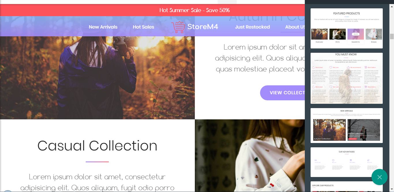
With StoreM4 Bootstrap eCommerce Template we have 4 kinds of predefined navbars with plenty of adjustable options. We can select from the classical clean and simple Mobirise Builder menu block with navigation links and buttons, pretty much the same but this time just appealing icons instead of buttons for much better utilization of the space available also selecting from predefined light and dark appearances so you don't need to restyle anything but just apply some minor tweaks but frankly my personal favorites are the last two navbar blocks due to all the new cool and useful features they are providing like:
Centered layout
All the navbar content comes centrally aligned around the brand's name or just logotype which helps building a strong identity feeling and also has one quite cool application – the mobile menu toggler appears centered as well once the page gets displayed on mobiles.
Frankly – the first time I saw this I thought it was a glitch – a simple declaration needing to be altered in order the so called "Hamburger" button to take its regular place – either to the left or the right of the screen but then, after spending just a few minutes browsing the test page I have created for looking the bootstrap ecommerce template around with my relatively archive Sony Z1 Compact phone I was amazed – this was so convenient! Here is why:
As shared above my phone isn't one form those with the very large tablet like screens – I just measured it and it something like 65 mm wide. What I do regularly is using it with one hand tapping and scrolling around with my thumb. So when it comes to clicking on the menu toggler I either have to squeeze it real hard in order to reach the opposite side of the screen or, in case the button is one the side my thumb is – I need to change the grip in order to reach it.
In time this actions became unconscious – I just did them when needed – until I got to the StoreM4 Bootstrap eCommerce Template navbar where I didn't need to do any additional grips or squeezes since the toggle was so conveniently placed in the middle! I was amazed – something so small and simple was improving my browsing experience so much!
Now let's take a look at this from the potential buyer's point of view – finding this innovative and easy way navigation on mobile on your store I'm pretty sure the people will probably look at the site with much friendlier eye and eventually – will buy more.
Gentle and appealing appearance – entirely customizable
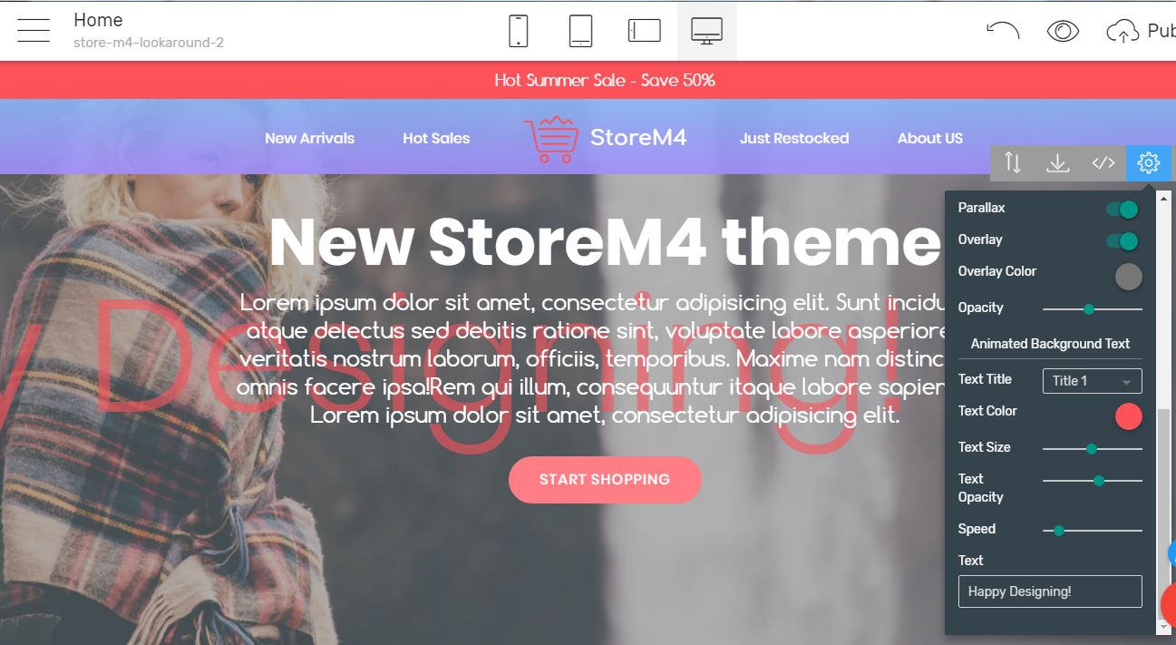
The new navbar isn't just structures conveniently – it also has quite a few features making it please the eye. With the cool controls taking place in the block's Properties Panel you can easily assign gradient background to it and even more – adjust the how much the visitors can see through it making it semitransparent as much as you need to.
Point out what's important
There actually is something more – you can easily drag your visitor's attention placing some essential info in the switchable top bar which can be placed over the navigation. This way, as the placeholder text gives you a tip – you can easily spread the word about any promotion, new collection or whatever important you want to push forward.
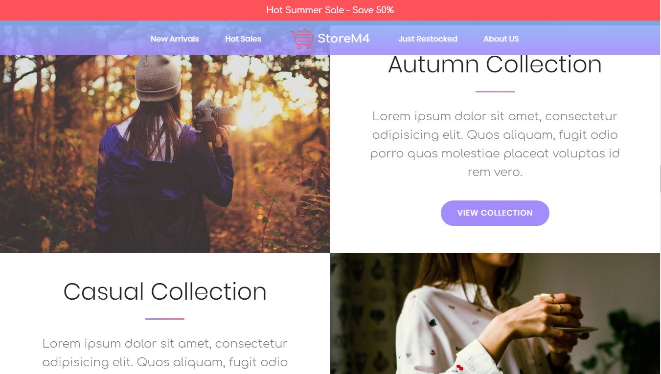
Headers
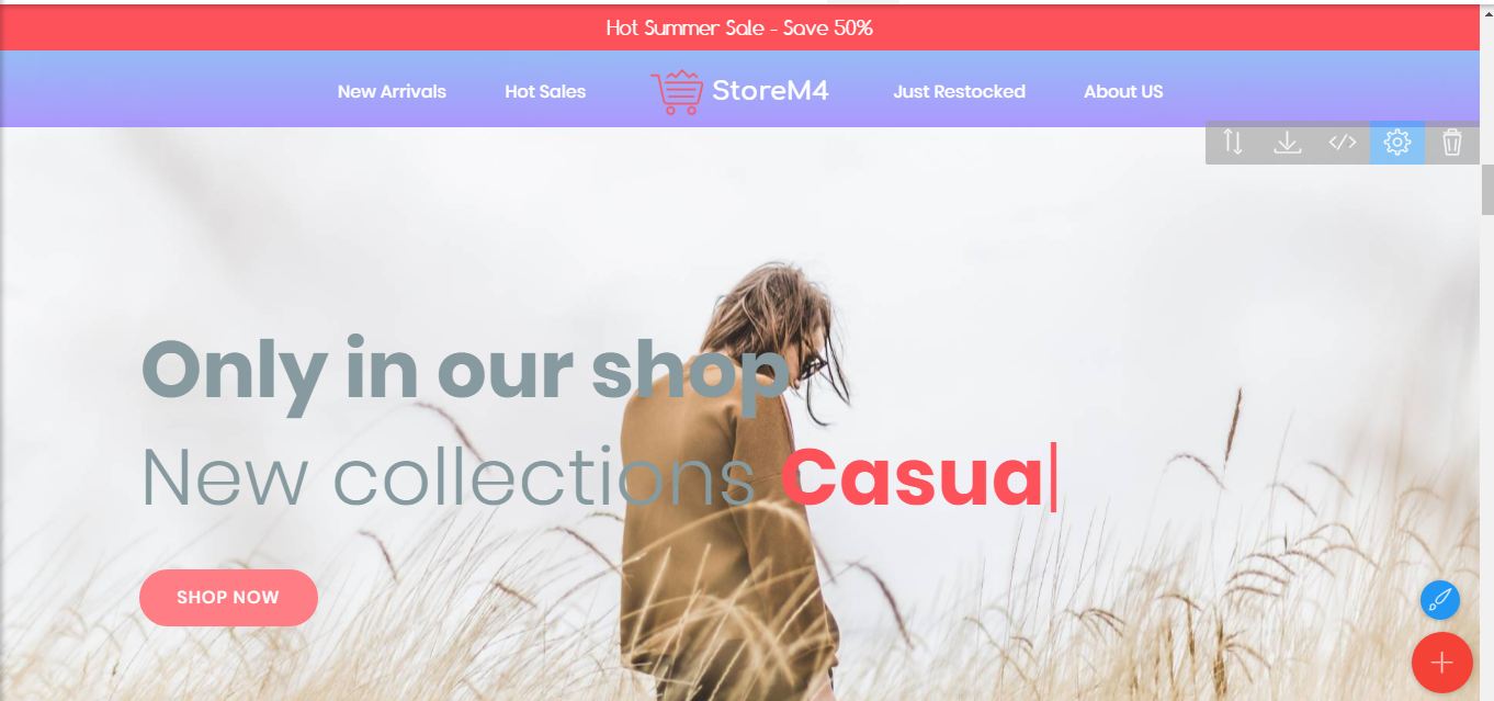
The headers or the so called Intro blocks in the legacy versions are a real box of hidden gems. Firstly taking a look at them one could say they differ by just the image placeholders.
One saying this would be wrong – each header comes pack with a cool and original effect you could use for making your content pop. My personal favorites are
Scrolling semitransparent background which comes to be a part of the very first block. The effect is quite appealing and easily adjustable – you can craft each detail like the text style, color, level of transparency and scrolling speed in just a few simple clicks in the block's Properties panel
But there is even moreScrolling image background
Pretty much the same as above but this time the whole background gracefully slides from right to left on the screen. The movement is really subtle and combined with the proper image (which border can't be actually distinguished) this block helps us easily achieve rich and powerful appearance
Gradient overlays
For even more rich and catching looks and setting the accents wherever we need them to. The cool part here is you can freely adjust the gradient colors and the amount of translucency of the whole thing playing with your imagination and easily achieving various catching effects like a pro
Flexible and thoughtful
Now thinking of it – that's the impression the whole StoreM4 Bootstrap eCommerce Template leaves in me. Even the tiniest details are taken care of so you can craft even the tiniest details. The example for this is the Header with the built in option to control if we need the overlay to be linear for setting the mood or radial for unconsciously focusing the viewer's attention on whatever takes place as block's background
Headers with features and even video pop-ups
Sometimes we need those so we can present some really important points right from the start. Well in StoreM4 Bootstrap eCommerce Template we have them out of the box. The video pop-ups are especially useful since they do keep the image safe until the user got interested enough to click and view it (actually getting it hidden actually sometimes triggers the action itself – like "Let's see what's been hidden there") This aids the speed of the page load since the video load is delayed and also saves precious space – the video gets displayed in a lightbox for best user experience once triggered.
Typed effect
I really love this one from the v3 Mobirise 3 theme Additional Blocks pack. It's so cool admiring the screen where it looks like someone else is typing, erasing and typing something else right on your screen. It's a fresh and cool way starting some kind of conversation with your visitors and potential buyers.
<href="https://mobirise.com/bootstrap-template/shopping-cart-template.html">
And of course – just like in all the Mobirise Builder v4 Top Free Bootstrap templates – each header can be styled to either automatically scale to take place equal in size to the whole screen of the device the page gets displayed on or be as high as much as needed for the showcased content to take place.
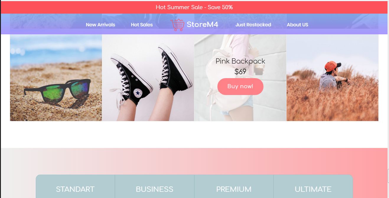
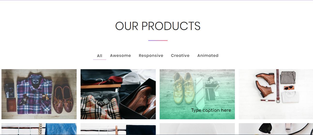
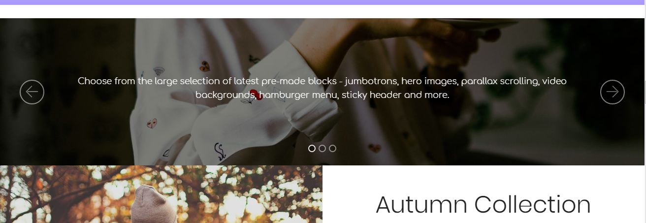
Sliders and galleries
These are pretty much the same as in the default Mobirise 4 theme except again for those little appearance details which actually are those giving the visitors rich and colorful experience while spending time browsing the site. The gallery thumbnails are cozy separated by a padding not too big but still enough to gently outline them along with the text which can be placed over each one for the visitor to better understand what's been presented. Not to be forgotten the gentle semitransparent overlay color gracefully emerging over each thumbnail upon hover. Of course – each appearance element is entirely customizable by the block's Properties panel
When it comes to image sliders along with the default full-screen element we also have a sleek and very flexible slider which can be adjusted in both height and width in order to fit exactly the space we need it to on the page. When the height is being altered (logically) the slider becomes shorter or taller and if we manipulate the width of the element we are easily able to get a boxed view appearance.
Free thinking on this one I guess it could be easily tweaked and for example appear over another adjacent block which practically will produce a smaller image slider inside a features or content block for example. Of course this should be done considering the different screen widths so we don't get unexpected results at a specific viewport but that's entirely different story
A really full armory of features
Well it's great to throw out some impressive words and images out in the space but once we get our visitor's attention it's time for all of those little details which, just like in the page's appearance itself are the ones breathing life in the big picture.
When it comes to features StoreM4 Bootstrap eCommerce Template is not only fully packed for practically any case but in my humble opinion the design of the features blocks itself is very carefully crafted and well thought. The proportion between text blocks and imagery is carefully considered – proposing large scale images splitting the viewport in half leaving the rest for explaining what's been presented keeps the visitors focused and helps them easily follow the line you would want them to. And of course – we have predefined cases for both light and dark appearances so no minor thing stops our creative workflow.
Having in mind the purpose of the Bootstrap eCommerce Template the dev team has prepared plenty of e-commerce specific blocks which are appropriate labeled and well designed, so if you're looking for an information block, way to present the advantages of your brand or the new arrivals – just pay attention on the block's headers – it's all already there waiting you for just throw it in the proper position
Let's sell!
Well, after he has got the visitor's attention, proven our brand's the best I guess it's time for giving the visitor the opportunity to actually buy something – that's what online stores are for aren’t they?
Free your mind!
I guess here is the place to point out the Builder's unique way of creating web stores which makes it perfect for ones wanting to carefully craft their store in a unique way presenting their individuality and brand.
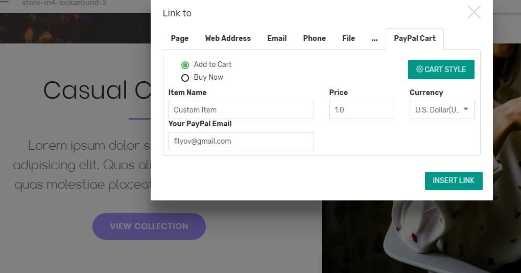
What I mean here is that with the help of the convenient and secure PayPal extension you can literally sell a product from any block on your page – all you need is to assign a PayPal functionality to any link or button. So no more boxed layouts if you don't need them
Order with ease
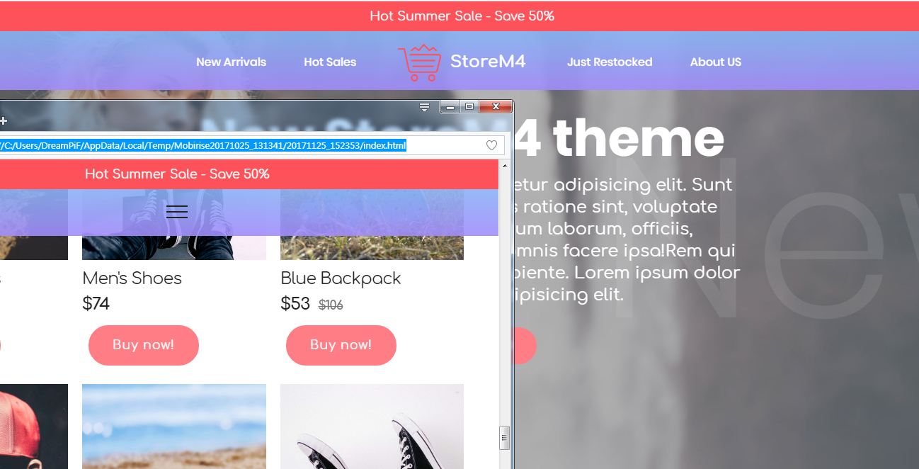
If you do however the StoreM4 Bootstrap eCommerce Template got you covered with quite a few appealing and flexible shop blocks. Some of you might remember the shop block from the premium M3 themes – it's a clever way for us to place the store section wherever we need to on any page and still have the content we need around unlike the CMS solutions which are more or less limiting in this direction.
Handling the store blocks is really easy since once you take a look in the block's properties panel you'll be pleased to notice that it's pretty much organized as a gallery - you can assign the image of your product there and adjust some of its essential features just like you would if you were creating a gallery, just with plenty new exciting options. The shop blocks help you easily select if the product is on a sale or a best seller, share the old price or tag it for easier finding.
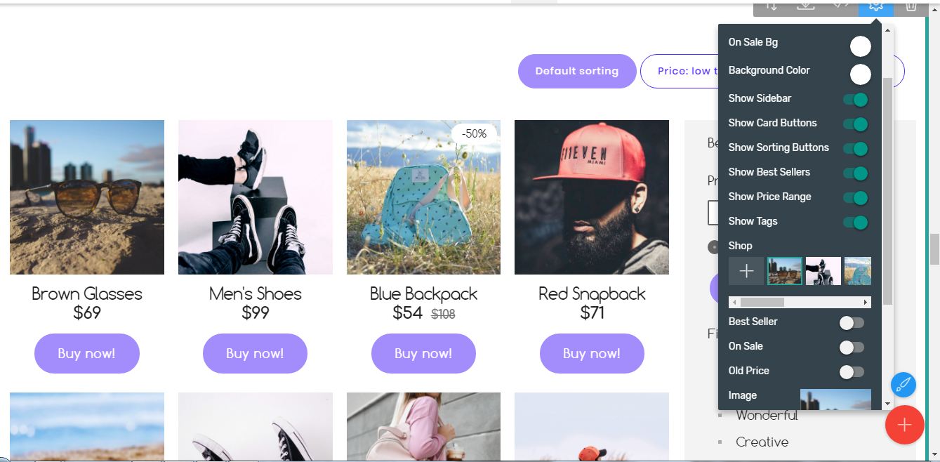
And of course, if you need to you can bring out a convenient sidebar which will help the potential customers navigate through the items, sort them by price or tag and will kindly point them out which items are sold the most.
Just type it down
Another unique thing about setting up a store with Mobirise Free Website Builder for Bootstrap 4 and the StoreM4 Bootstrap eCommerce Template is the easy and intuitive way of inserting the details about each product initially or later on. Following the whole program's approach you can just click on any value right inside the Builder's graphical editing environment and change it as if you were editing a regular document – to clicking through endless grey forms and filling up boxes constantly previewing to see if the product is actually looking like you want it to on the front end like in CMS. It's so easy and intuitive that if you have edited a text document you'll probably manage to set up the shop block from the first time as well.
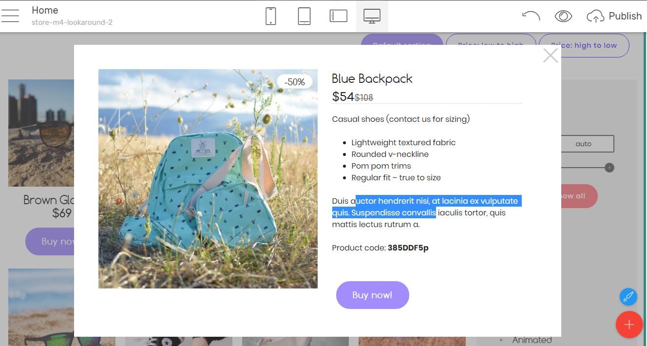
When it comes to filling up the product's detailed description – just click on any image and edit the pop-up modal with the product that will comfortably appear. That's actually pretty much the same way the page will act once published – clicking on a product image will display the details in a modal.
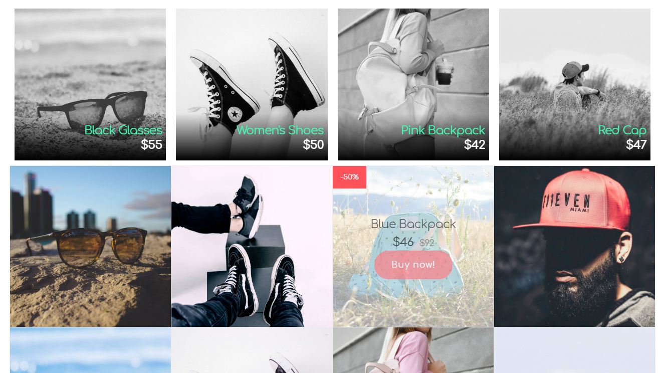
The perfect fit
Various appearances are covered as well so the context of the shop easily fits the essence of any product. Black and white turning into color once hovered, boxed or full width product images with descriptions either inside or underneath then – you name it. I if once you're starting to build your shop with StoreM4 Bootstrap eCommerce Template the most proper way figuring out what will work best for you is bringing a copy of all them out and experiment with the endless combinations from appearances and Properties panel settings until you find the perfect match.
Content is king
So we have already shown our products for sale but how about engaging out visitor's attention even further with for example giving them some interesting material to read. I'm sure you'll agree it's quite common one might need some extra information about the products, the trends in the brand or just the breaking news in the area of whatever is to be sold.
That's why the StoreM4 Bootstrap eCommerce Template comes also really well packed with all you might ever need to create a powerful blog page or a rich info section as well.
And since the visitor is always hungry for information but would not want to read something like a bank statement there are also quite a few appealing appearances combined with all the possible tools summarizing or graphically representing dry numbers and facts which just pasted in a text block could bore the viewer away.
Ways of presenting all the essential info for a store has been covered like the supported payment systems or where to locate the actual places to buy. For the long dry text there are convenient expanding tab panels hiding it until one clicks on the header showing interest in the subject and so on and on.
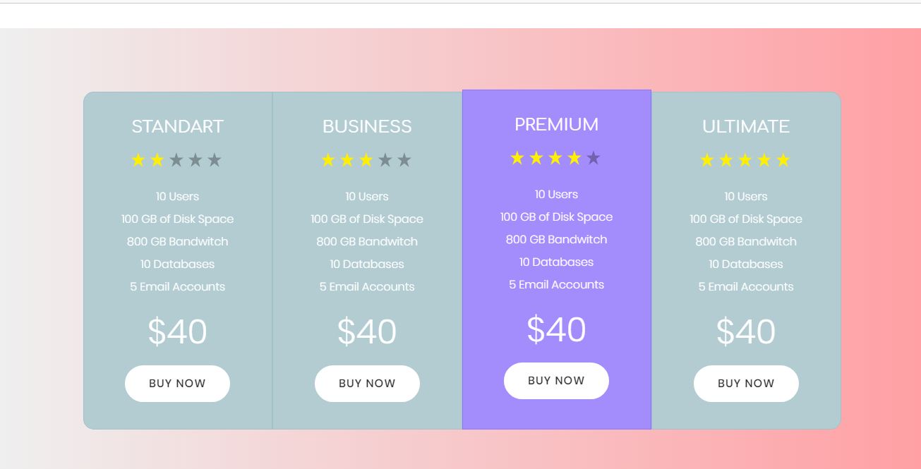
Of course, since it's a store we're talking about there are plenty of price tables appearances as well helping you easily talk about money in a way pleasing the eye so whatever you're trying to sell now you can present its price range and essential features properly.
There are also quite creative ways sharing your brand's story in a timeline also applying some appealing pictures, share the customer's feedbacks and experience and present the team behind the brand in quite a few clever and shiny ways as well.
So whatever content you need to share with the audience – the StoreM4 Bootstrap eCommerce Template got you covered
Final words
Looking back at the time spent with the Mobirise Builder so far and over this amazing new arrival – the StoreM4 Bootstrap eCommerce Template I must share I'm really charmed and maybe the most proper word describing the reason why is "balance". The whole theme is so well designed in both appearances and adjustment options that I found almost nothing to be stopping my mind flow while working with it. Whatever appearance I needed – I got it – if not predefined by just a few clicks in the properties. And of course – the details – those million little adjustable things that all combined are making the page and the brand it represents full and consistent.
And when we're talking about consistency there is one final thing coming on my mind – how well some of the graphical elements flowing through the theme are handled – like those little gradient lines appearing in many of the blocks – you could easily recolor them all by just altering the primary or secondary color in the Styles Editor – an action which otherwise could take up to an hour for completing just that.
So guys – whether you're just making your first steps in the world of web trying to figure out a way creating you very first low budget but appealing web page or if you're making a living form web pages and got down to here for just being curious what this noise is all about – my friendly advice is this – go for it! I think with the StoreM4 and the Mobirise Builder you can't go wrong. Happy designing!